Odyssey
On my way…
We have all felt the stress of sitting in traffic or being stuck in a packed train during another subway line delay. Without updated transit notifications or schedules, it is difficult to arrive at our destinations on time. We can’t predict traffic, construction delays and road closures to properly plan around it. Information about last minute delays or even parking lot capacity makes a difference in terms of understanding how early we should leave to get to our destination on time.
For this case study, I wanted to explore creating a trip planner mobile app that would be designed to help transit riders plan the most efficient route to their destination. It was designed to help make the planning process stress-free and easy by incorporating real-time notifications about public transit delays and traffic.
The Problem
Transit riders need a central and convenient way to stay up to date with the latest transit notifications and schedules so that they can arrive at their destination on time!
So…
How might we deliver accessible real-time information to provide transit riders a more efficient ridership and travel experience?
Research & Findings
The objective was to get an understanding of how travellers felt about their commute.
User Interviews
I interviewed 4 participants that:
All took public transit and had various ways of getting to their destination
Are working professionals between the ages of 30-35
My interview was structured around the below questions, where I had asked further follow up questions to gather more insight.
“Tell me about the last time you took public transit.”
“Tell me about a time you could have taken transit but took alternative means instead.”
“What motivates you to take transit vs the alternatives?”
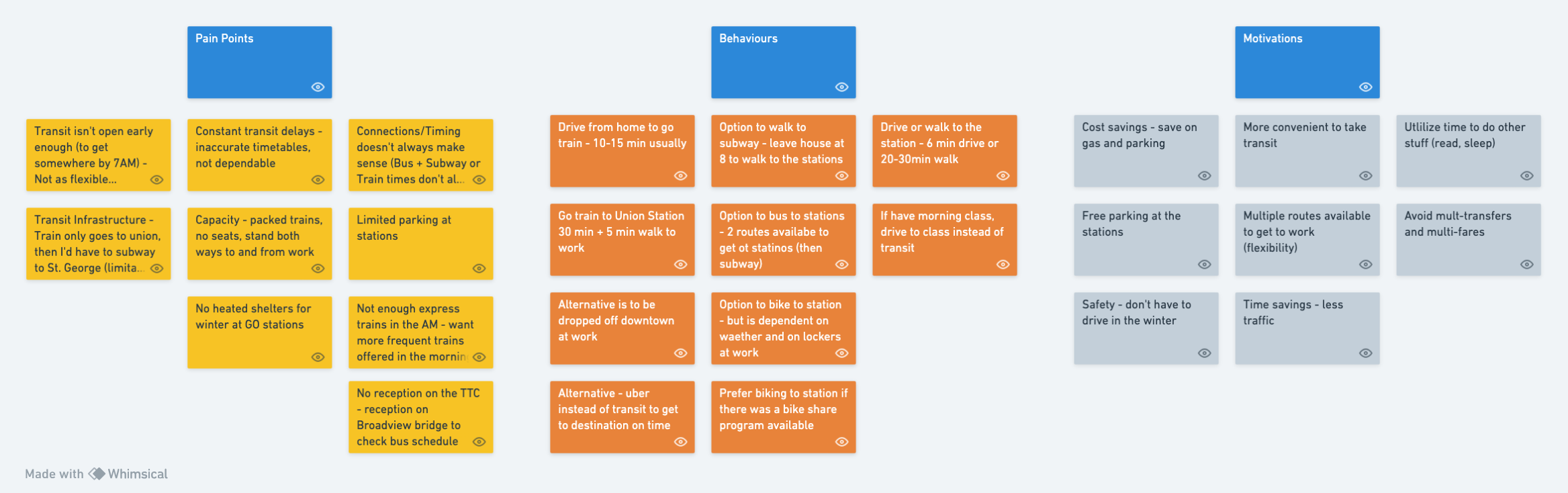
To analyze and synthesize the information from those interviews, I had used an Affinity Diagram to help understand the pain points, behaviours and motivations.
The Users

Organized
Problem Solver
Creative
Punctual
The User Experience
Bio:
Elizabeth is a newlywed that just moved into her new home on the east side of town. She recently adopted a new puppy and enjoys being a dog mom. Elizabeth works for a large firm in downtown Toronto. She is a project lead in a small team and thrives in a fast-paced work environment. As her office is in the heart of downtown, she commutes to work daily. Since COVID, she now commutes to work twice a week.
Goals:
Values a good work-life balance so plans routes to work to ensure she maximizes her time at home
Due to her unpredictable work schedule, she always considers the most efficient/quickest route
Challenges:
Her neighbourhood is notorious for road closures and construction
Even with different train options, there are always delay
With transit safety being such a hot topic, Elizabeth feels uneasy with taking transit during rush hours and would prefer to spend as little time on public transit as possible
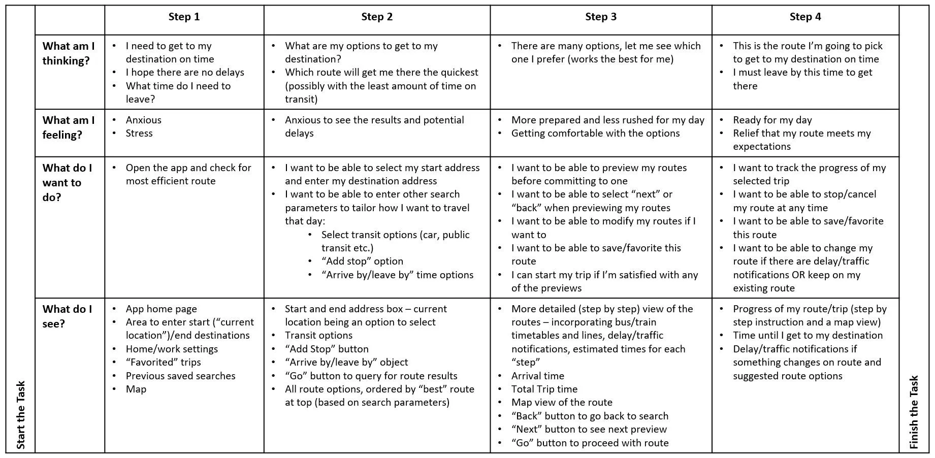
A customer journey map was created to further illustrate the commuter’s goals, thoughts, and pain points.
Behaviours:
Checks CP24 early in the morning for any major road closures
Take a look on X (formerly Twitter) for MTO and transit news
If there are major transit delays, Elizabeth will consider Ubering or driving to work
Design Approach
Ideation & Sketches
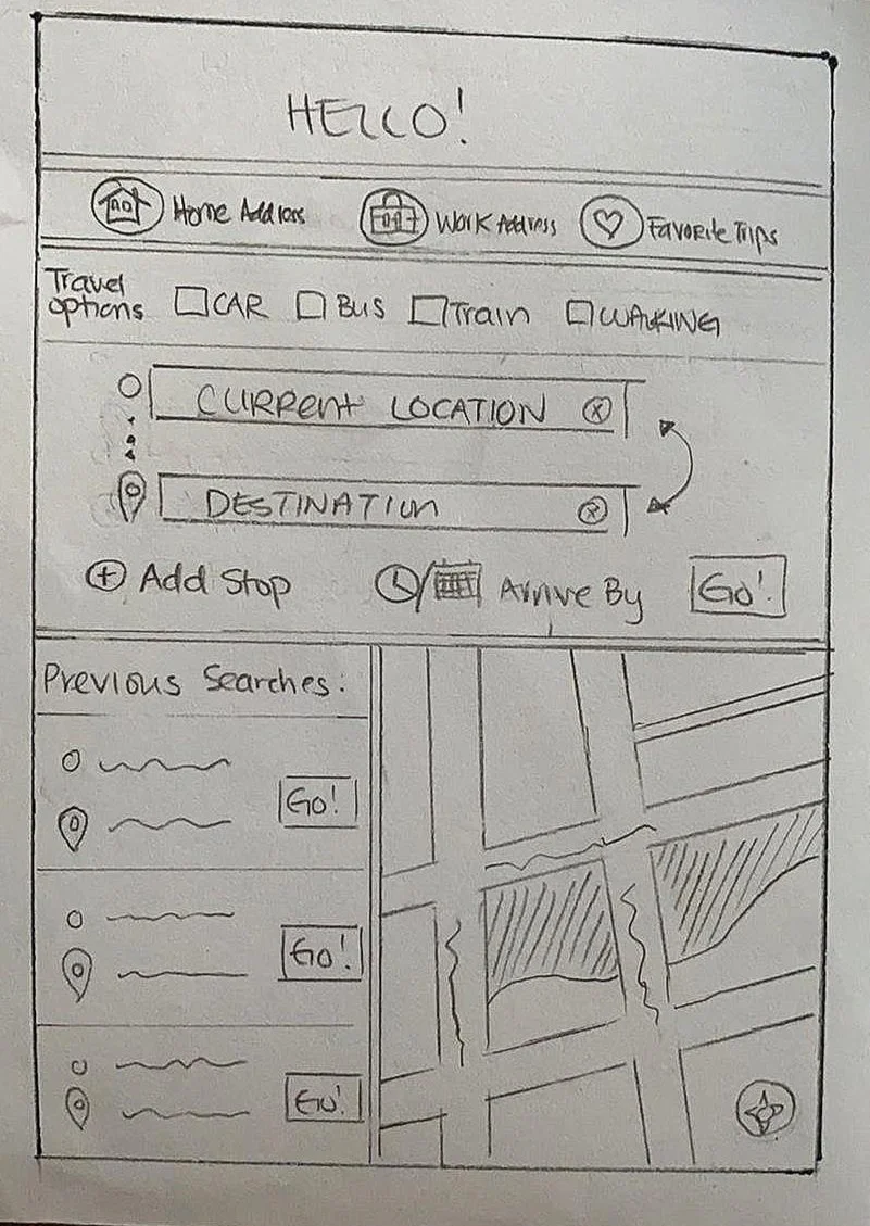
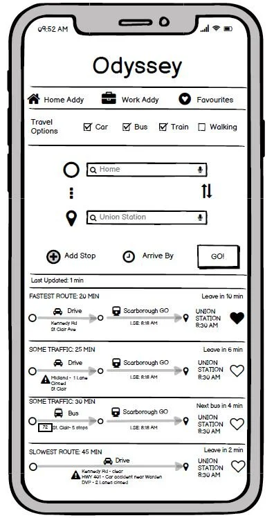
Based on the research, I had put together some sketches that captured the ideas from the customer journey. The user should be able to enter the parameters (destination, travel options, etc) of their query, select the route that best fits their requirements and then start their trip. Using the low fidelity sketches, I created a simple user flow and had users perform some testing.
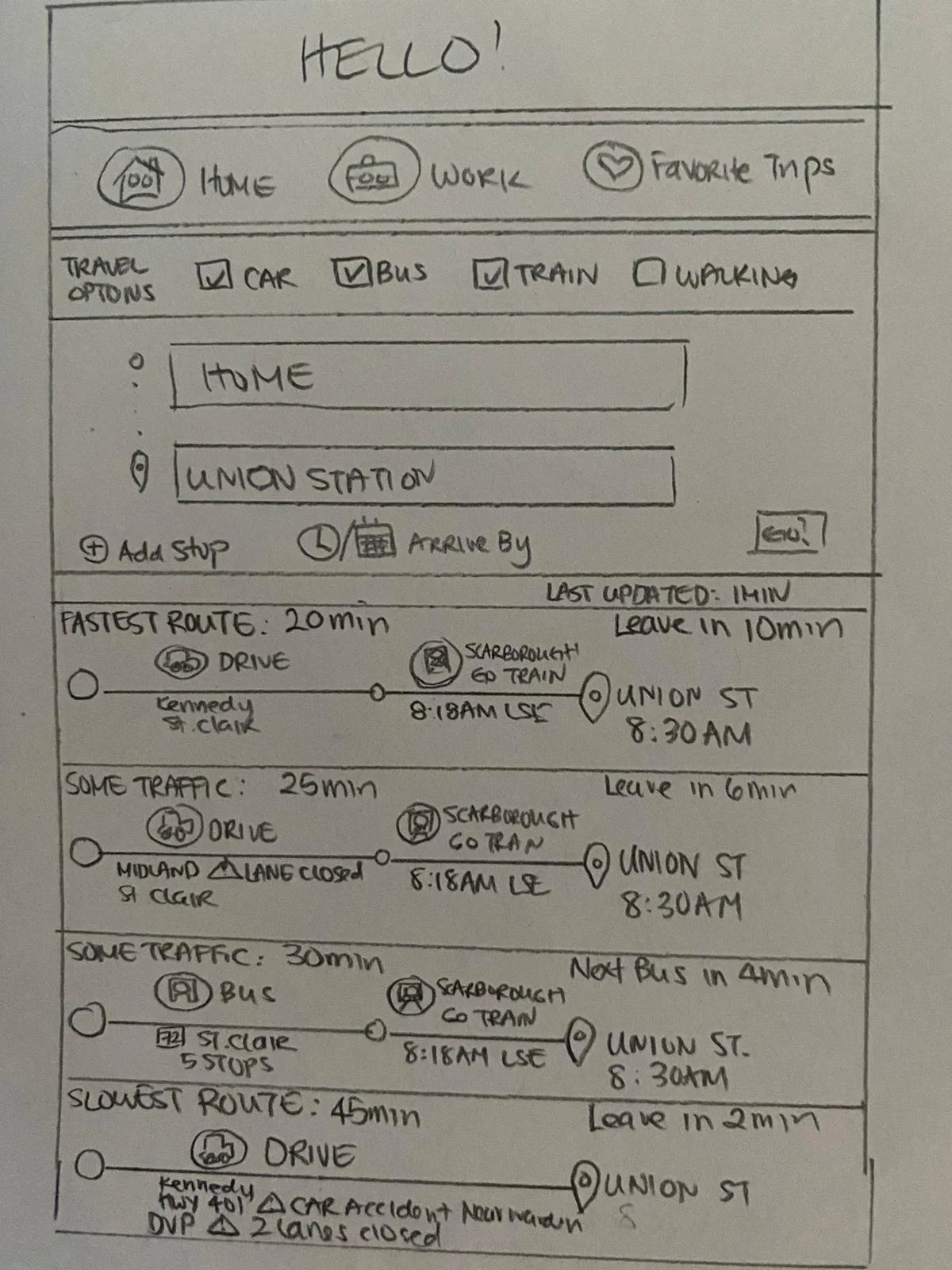
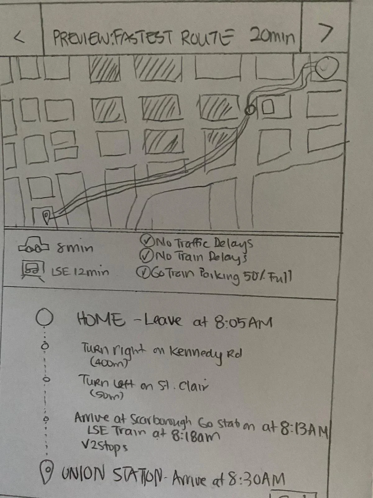
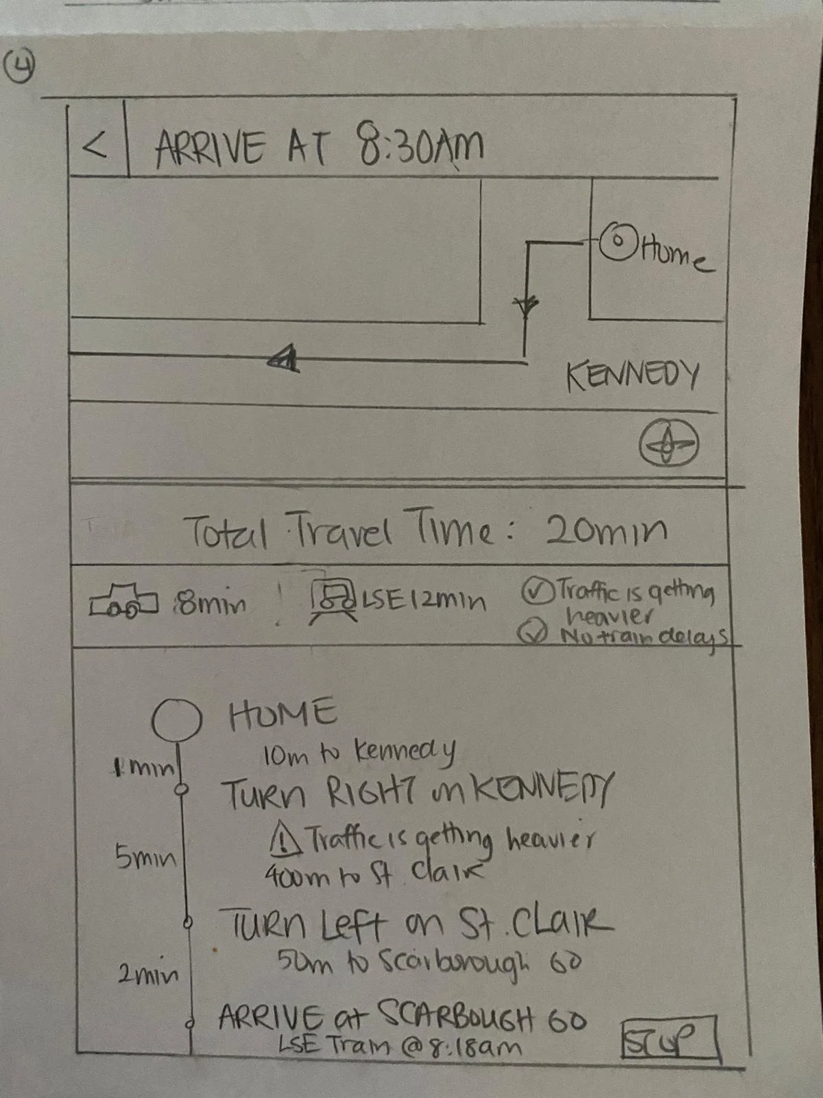
Usability Test & Feedback:
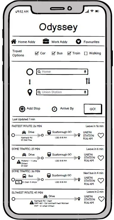
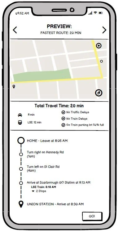
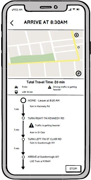
• Include a “Last Updated” status so the rider will know how recent the traffic updates are
• Include the total travel time
• Easy to follow and understand
• The flow of the app is intuitive
The Real MVP
The MoSCoW method was used to determine and prioritize the features required for the minimum viable product (MVP).
-
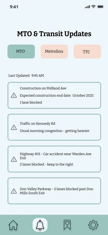
• Display current MTO, TTC, and Metrolinx notifications
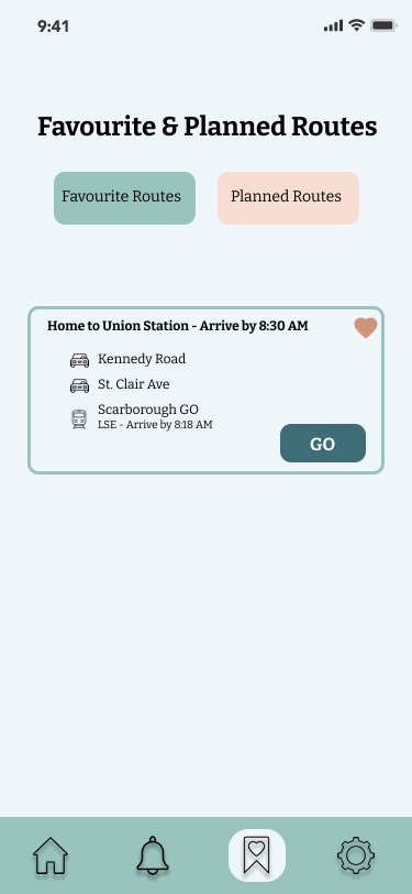
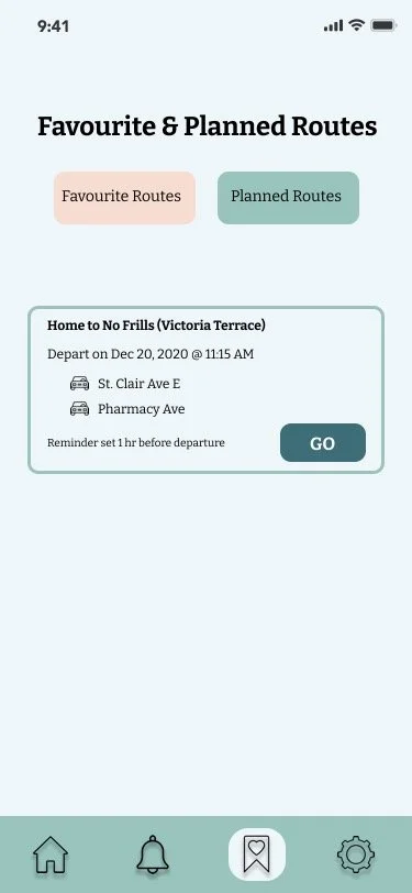
• Allow user to add “favourite” routes
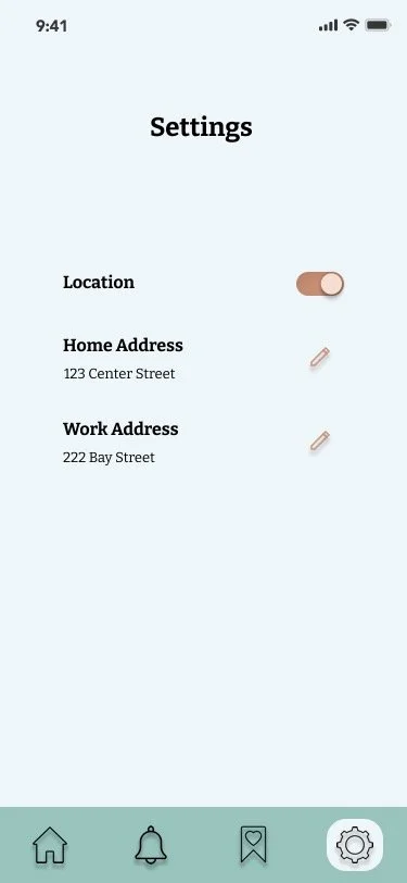
• Add home and work addresses for quick arrival or destination selections
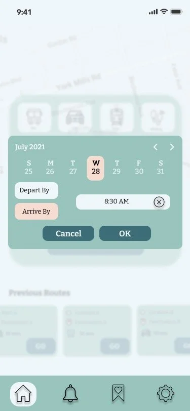
• Allow user to plan a trip by selecting the depart/arrive by date and time
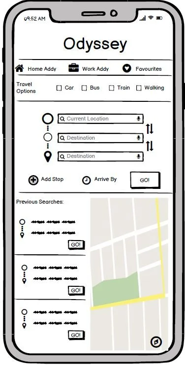
• View previously searched routes
• Restart previous trips
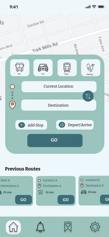
• Enable geo-location
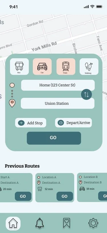
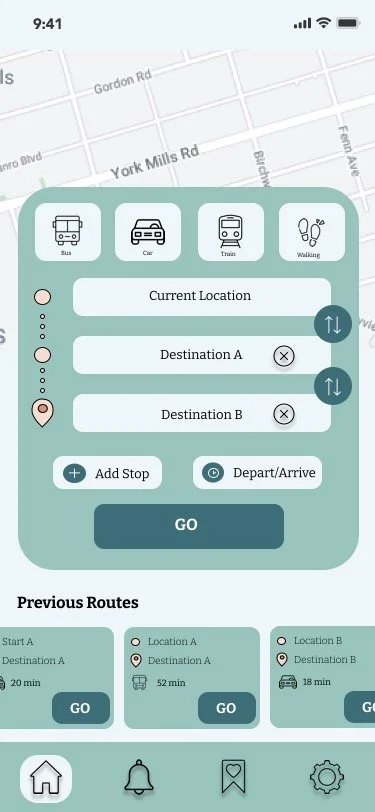
• Search bar for start location and destination
• Can choose means of travel or combination
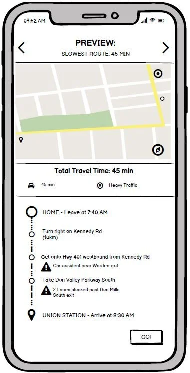
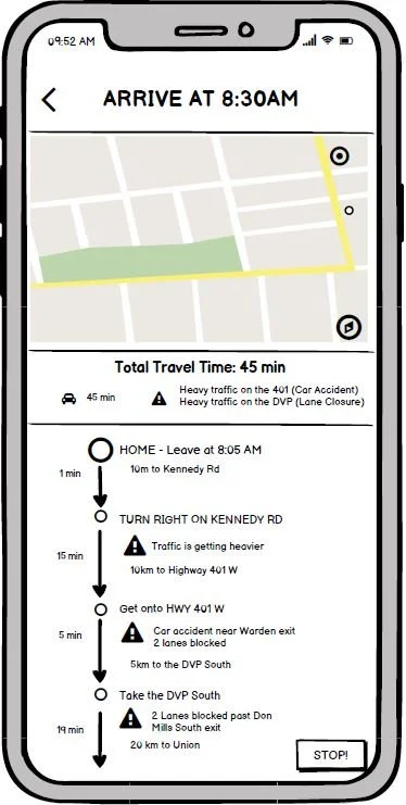
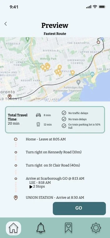
• Preview routes and show estimated travel times
-
• Notification to user if a better route is available and allows user to change route if preferred
• Can add multi-stops when planning route
-
• Incorporate Metrolinx parking lot capacity
-
• Incorporate TTC train capacity to account for packed subway cars
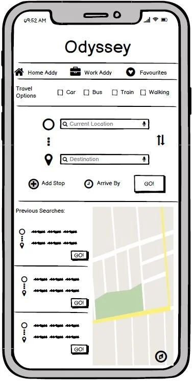
Usability Testing
A second usability test was performed on the updated medium fidelity screens. I had incorporated the feedback from the first round of testing and the features required to build out the MVP.
Final Frames & Prototype

Take Aways & Learnings
Conducting the user research is crucial to helping a UX designer understand the motivations and experiences of their target audience. Looking back at the overall project, I could have conducted a few more user interviews to get more insight into the rider’s experiences.
Usability testing is very important in helping determine what the expectations are and to also help improve the overall experience. I found that this is an iterative process and there are always things that can be improved.
A thorough competitive analysis would be helpful in providing insight into features, user flows, and functions that work successfully or unsuccessfully. This can be advantageous in the strategic design of the app.